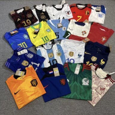
Rating Every 2022 World Cup Home Kit
- 18 November 2022
- Ranks FC
By Owen Murray & Jeremy Tenecela
With (hashtag) World Cup SZN merely days away, it’s time for one of the most polarising aspect of the tournament: the kits. Over the past weeks, federations have drip-fed release videos and teasers to their eager constituents, but finally we’ve got the full set.
64 kits to rate. We’ve remarked and referenced through the lot, and given you our best advice on how to spend the sum you’ve saved up for your nation’s effort. Does it work with jeans? Would it fit in Back To The Future? Is it one better left to your nearest dumpster fire?
Let’s go!
GROUP A
Qatar: For their first World Cup the hosts have gone with a lowkey look with a white triangle design for the sleeves leaving the rest of the design in the same red of their flag. There isn’t much to say about this. It’s about as cookie cutter as you can get. At least something about Qatar isn’t mired in controversy. 5/10
Ecuador: Since the FEF remodelled the Ecuadorian Badge, (small condolences to the now gone condor) Marathon have slowly begun to try out new designs (more on their big hit later) and unlike their abysmal effort during the Copa America, they’ve gone with a more subtle and relaxed approach including a background with waves accompanying their trademark yellow. 7/10
Senegal: The best thing about this is the tricolour collar and trim (it’s Ajax Bob Marley kit vibes). It’s a cool look that goes back to the flag, and for an international kit, that’s a great reference. The arrow on the chest also resembles the flag, and as such I’m happy with it. It’s not overcomplicated (like their away), but that’s fine with me. 8/10
Netherlands: Nike have gone with an innovation on the classic orange that the Netherlands have relied on for so long. Like Brazil’s iconic yellow, it’s difficult to change. While I’m not an overwhelming fan of this, it’s a light change that makes it nicer to look at. As long as it’s not giving traffic cone vibes, I’m going to do them a solid. 7/10
GROUP B
England: The Three Lions are throwing it back to the gradient days with Nike, and the blue pauldrons just aren’t it. They’re serviceable, but not standout. Their Euro 2020 kits were too simple for some, solely featuring a brand logo and the badge with black seams, but these kits feel like a brand of retro that we’re not yet prepared for. In the words of Marty McFly, “Guess you guys aren’t ready for that…but your kids are gonna love it”. 6/10
Iran: The Iranian home kit’s only notable feature is the leopard spots on the arms. It’s quite similar to the England home in that the relative simplicity of the chest stands out in a discomforting way. It’s unclear if there’ll be a number there, but regardless it’s down to whether the shoulders work with it. Most likely, it won’t, and so this doesn’t score highly. 5.5/10
United States: Sigh. If only they’d kept the qualifying kit. It was comparatively *so* good, and it would’ve even been better if Nike had gone with the American flag imitation, or Bomb Pop. Or Waldo. Or the Denim Flag. This is only iconic if Christian Pulisic rips it off when he scores a last-minute winner against England to reveal a shirt that reads “It’s Called Soccer”. Chances of that happening? Ask someone who’s not biased. Otherwise unimpressive, doesn’t look good with a World Champions badge (ask the USWNT), so that’ll undoubtedly be an issue after they win it all. 4.5/10
Wales: Red on Red never looked this good. Wales have knocked it out of the park with this kit, the white stripes along the shoulders combining with the green collar make for an incredible contrast. A worthy choice that holds the honour of being the first World Cup kit the Dragons have had in 64 years. 9/10
GROUP C
Argentina: There are some kits that you don’t ever really change because they are certified classics. Argentina have taken that to heart and outside of outlining the black on the collar and sleeves, have stuck to virtually the same kit as 2018. 6.5/10
Saudi Arabia: From the palm leaf background pattern to the green colouring on the collar this kit nails down how a white kit can stand out from the pack. If only the badge matched with the green they used for the collar and logo. 7.5/10
Mexico: An eye catcher with its shades of green, Mexico has opted for red stripes along the sides, a slight deviance from their usual white. A background wave design pulls the kit for a good but not outstanding effort. 7/10
Poland: I’m still not a fan of the shoulders-only design. I like this a hair more than the leopard spot thing Iran’s got going, but I’m going to preach again that it isn’t as nice to look at as a kit like Japan’s. I wouldn’t be offended if this pattern was on the whole shirt. 6/10
GROUP D
France: Gold and blue is always a win. Royal for the reigning champs seems right, and Nike have knocked it out of the park with the design. France’s 100th anniversary kit featured the same gold highlights with the collar, and it’s one of my favourite kits ever. This darker shade of blue feels right for the first-ever winter World Cup. 9.5/10
Australia: This shirt has that “I got paint on my hands and rubbed them on a canvas repeatedly,” aesthetic in my opinion. It still does feel a little plain, yet I can’t help but appreciate it whenever I do see it. Nike says the design is representative of Australia’s ecosystems and to be honest it’s a type of heat you can only expect from the Socceroos. 7/10
Denmark: The Danish kits carry with them a strong message; Denmark, in their design, were one of the first to speak out against the nature of the tournament’s inception and foundation. Their three kits, in red, white, and black, are entirely monochrome with simple underlying designs. Such a message enveloped in a good-looking kit is admirable, and Denmark have spoken out in a way that they felt would be noticeable. 7.5/10
Tunisia: An elegant design that takes inspiration from 218 BC, Tunisia have based their background pattern on the Armour of Hannibal; the famous Carthaginian general who led Carthage in the Second Punic War against Rome. While the design is very intriguing, it does seem a bit too much for a football kit. It also isn’t inspiring to know that Carthage lost the Second Punic War and after the third they ceased to exist when Rome sacked the city. Let’s hope Tunisia fare better in their group. 6.5/10
GROUP E
Spain: Sometimes simple is sweet. Unlike their neighbours to the west, this kit is proof that sometimes innovative designs aren’t necessarily the best and the tried and true still bear fruitful results. The gold on the Adidas logo and Crest complement the red background as expected for La Furia Roja; the blue stripes along the shoulders and collar pull together the whole kit to create a great effort all around. 7.5/10
Germany: This is the pinnacle of home kits this year, while I’m not a fan of the badge and supplier in the middle of kits, Germany brings a level of class to it with the gold black and white colour scheme proving there is always an exception to the rule. No notes, no room for improvement. 10/10
Costa Rica: Now this is both clean and simple. It’s a nice shade of red with some complimentary blue on the sleeves, if I had to define inoffensive as a kit this year, we have our winner. That being said, it is a little bland. 6.5/10
Japan: The Japanese kit features a pattern that (makes me happy!) covers the entire face of the kit. It’s not striking, but all the same it’s an effort that looks good in blue. No one’s complaining, I’d be happy if I got it out of my Ultimate Team starter pack, and there’s nothing horribly offensive. Against the field, we call this a big win. 8/10
GROUP F
Belgium: A kit I think only Guy Fieri could love. The flames don’t work as an addition to any jersey (slight foreshadowing), they will always look out of place. It’s a shame Belgium. I wanted to root for you as well but just because your nickname is the Red Devils doesn’t mean your jersey should belong in hell. 2/10
Canada: Imagine not qualifying to a World Cup for 36 years of hurt, disappointment and underachievement, then finally, you are led to the (slightly controversial) promise land by what is undoubtedly your golden generation, only for your kit supplier to neglect you as you go into the biggest sporting event in the world without the hype of a new kit. For shame Nike. For shame. N/A
Croatia: Croatia’s historical chequered kit was iconic in their run to the 2018 final, but Nike have felt the need to innovate on a design that I’m not sure needed improvement. It was one of those kits I felt went well with any outfit, but the missing checkers fuel an incomplete design. Bring back the rest of the checkers. 6/10
Morocco: The thing that puts me off this kit is the fact that they decided to go with the supplier logo in the middle and place the badge off to the side rather than vertically aligned as on the away outfit. The badge is just a little too big for the green stripe as well, giving the impression that it’s all a bit mismatched. Otherwise, it’s just a red shirt with a green stripe. No underlying patterns to redeem it mean that I can’t rank this higher than Costa Rica. 5/10
GROUP G
Brazil: Like their South American rivals Argentina, this kit is a classic and there is a reason why throughout its history there have not been many alterations, however with the added nuance of the background pattern being inspired by the fur of the jaguars that roam the Amazon they’ve knocked this version out of the park. Now that is how you upgrade a classic. 8/10
Cameroon: After AFCON I was looking forward to seeing what Cameroon would be bringing to the table. They were one of the best-looking kits in the whole tournament and I imagined they’d find a way to improve an already great kit for the biggest tournament in the world. As the old saying goes, when you assume…
The yellow “one” (their new sponsor being One All Sports) looks odd in the middle. It also looks like they’ve turned to Optimus Prime as their inspiration for their background pattern. With any luck maybe they’ll be accompanied by a Linkin Park song for their games. Indomitable Lions, rollout. 4/10
Serbia: This may just be the most underrated kit of the lot. Serbia have a hidden gem on their hands with this kit. Red and Gold is a match made in heaven. The subtle crosses in the background keep it from being just another standard red kit without going overboard on the overall design. Simple, effective and easy on the eyes. 8/10
Switzerland: It’s a bit gradient-esque, but I’m glad they didn’t paint it under the row of badges on the chest. Switzerland have a really cool and convoluted FA logo, and it deserves to stand out. There’s nothing incredibly shocking about this. You could argue that the gradient is difficult, but I’m disregarding that because the flag is a huge plus. 6/10
GROUP H
Ghana: While I do like the simplicity of the plain white background, (bonus points for the green red and yellow striped sleeves) this kit leaves a lot to be desired. The black star in the middle also reminds me of the stickers elementary teachers gave to the kids who were the best little helpers. 5/10
Portugal: In the same way Cameroon had a downgrade in kits from AFCON, Portugal have also had a downgrade from their Euro 2020 kit. The half and half triangles do not work, and while you do applaud the attempt at innovation, sometimes you just have to admit when it isn’t up to scratch. At least Cristiano won’t complain that it’s the same as the last time he was there. 4/10
South Korea: Hear me out. This one is okay with just the sleeves. The tiger stripes relate back to the badge (bonus points for design choice) and the red kit versus a black or white background make the shift less noticeable. It immediately stands out just from the colour (like a Borussia Dortmund kit does), and a home kit doesn’t need to be anything but recognizable. Not running around screaming on either end of the scale. 7/10
Uruguay: Remember what I said about how sometimes simple is sweet? This is undoubtedly one of the best examples of that. A kit that calls back to 1950; the last time La Celeste won the tournament. This is a jersey you could drop anywhere in the World Cup’s history and it wouldn’t look out of place. 8.5/10