Rating Every 2022 World Cup Away Kit
- 19 November 2022
- Ranks FC
Written by Owen Murray & Jeremy Tenecela
The importance of a football kit cannot be understated. It can be the difference between creating a memory of a once-in-a-tournament screamer, or just a pretty good goal. It often proves the final decider for many neutrals as I, a person whose national teams seldom make it to the big stage can attest to. As shallow as it sounds, sometimes the deciding factor can really be as simple as “shirt looks cool.”
That being said, we’ve already reviewed the home kits and now it’s time to spotlight the away kits. From the immaculate to the down right down bad, we are here to inform you on what’s the next Nigeria 2018 and what deserves to be banished to the Shadow Realm.
Without any further ado, let’s get down to business.
GROUP A
Qatar: I can’t decide if this one looks like it has grass stains all over or if the tan scattered pattern is cool in a low-key way. It seems to be more of an underlying pattern than an accent in most of the promotional content, so I’m happy with it. At least it’s not just a white shirt with a crest (sigh). 6.5/10
Ecuador: As said in the home kit rankings, Marathon have begun being a bit more experimental with their designs for La Tricolor, and they have done an outstanding job with the away kit. The elegant background design is complimented well by the white crest and sleeves. The navy blue definitely helps it all stand out. 9/10
Senegal: This’ll probably come up a lot, but I’m not rocking with this Puma away kit design. It’s the same as it was when they released the club away set (remember the ring across the chest with the club name and no badge?). This at least has a badge, but I can’t get on board with the Transformers logo outline in the middle of the shirt, and no amount of design on the shirt is pulling it back. 5/10
Netherlands: The contrast of the dark orange on the badge with a darker shade of blue than previous Dutch away strips is interesting, and while I’m not a huge fan of the black secondary colour below the collar, I once again like the multicolour sleeve-end highlights and everything else is neat and tidy. 7.5/10
GROUP B
England: This one’s a real beaut. If it was up to me, England would wear this all the time. The blue trim is a relief from the gradient on the white background in the opposite number, and the red is one of those standout colours that allows for a dynamic identity to form around the kit. England fans will be buying this one for sure. 8.5/10
United States: I mean…at least this one has a pattern? Somehow, the two American shirts fail in different ways, with the home criticised for its simplicity and lack of personality supporters seek while the away fails to capitalise on an opportunity for innovation. That French away is stunning. That’s what I’m looking for in a secondary kit. Not this. 5/10
Iran: Everything I said about the Iranian home strip applies to this, except the shirt is red. Minus points for a lack of creativity, and I’m still not into the shoulder-exclusive patterns. These shirts are for creativity, and it’s not here. 4.5/10
Wales: With the amount of white kits around this year it can be hard to stand out from the pack, but Wales manages to do that with their lovely away kit. The green and red trim compliment the white extraordinarily well, with a winter World Cup this year I can’t help but notice the Christmas colours a little more. 8/10
GROUP C
Argentina: Ah yes more flames, as said in the home kits ranking it just doesn’t work. Although the purple is a wonderful colour for contrast, the flames seem like something you’d see on a Hot Wheels car or the late Bam Bam Bigelow than the Albiceleste. It takes away from what could have been one of the best. 5.5/10
Saudi Arabia: For their away Saudi Arabia have gone with a green on green kit with a tonal pattern that covers the entire kit. I can appreciate the fact that they didn’t stop the pattern at the arms, but something about this design does scream mulch, maybe that’s the old landscaper before me. Kudos for having the lighter shade of green match the badge this time.
Mexico: A kit honouring the country’s indigenous roots. Adidas have outdone themselves with this one, the cream and red contrast are wonderfully fresh and stand out among the rest of the pack. One of the top kits of the tournament. 9.5/10
Poland: Poland isn’t necessarily known for their flashy kits, and while I do imagine what it would look like I can’t help but enjoy the simplicity of their usual designs including this red with white trim. Straightforward and uncomplicated, not much more to it than that. 6.5/10
GROUP D
Australia: Something that looks more comfortable at the Rugby Championships than at the World Cup. It draws inspiration from the sea that surrounds the country, with the green trim representing the creatures and plants under the seas. Serviceable yet still feels a tad dull. 6/10
France: Oh MAN. This one is awesome. Nike really went for it with the underlying pattern, and it looks fantastic. It takes inspiration from the French women’s Euro 2021 with the inclusion of flowers woven through the Arc de Triomphe and the FFF’s legendary academy, Clairefontaine. It’s so much more than a white shirt with a badge, and it tells the history of a country and FA that are amongst the best of all time. United States designers, take copious notes. 9.8/10
Denmark: As with their home, Denmark’s supplier Hummel, have relayed their message through their kits, in their own form of protest. Opting this time for a white monochrome design that is as irresistible as their message is admirable. There is nothing to hate about this one. Statement Made. 9/10
Tunisia: In the same vein as Cameroon, Tunisia have kept along their background design for their away kit. The Armour of Hannibal background looks far better outlined in Gray on a white kit than it did on their red home. The red trim helps keep this from being another white kit. 7/10
GROUP E
Spain: This is some f(x)=sinx work from my Calc class, and it works great. It’s literally wavy! The accents look great, and the only thing I’m worried about is the stack of brand logo, crest, and possibly number (if they follow the Nations League kit’s style) looking strange. Otherwise well-executed and I’m happy it’s on the away shirt. 8.5/10
Costa Rica: Similar to their home kit, New Balance have kept it quite simple with Costa Rica, keeping the same blue bands on the sleeves this time with a white background to pull it all together. Still a bit plain but sometimes it’s best to not overcomplicate things. 6.5/10
Germany: Can I officially say that the away field is better than the home set? The German away in red, black, and gold is a stunning display of the use of a single pattern shirt, and it’s executed to perfection by Adidas. Their home is equally well done, and the use of golden highlights in a tournament renowned for its legendary trophies’ similar hue is perfect for the occasion. Plus, the red and black is a throwback to that 2014 World Cup team. Why not? 8.5/10
Japan: That shoulder pattern is so cool. I wish it was on the rest of the shirt. I’m boosting this one because of the look on the shoulders, but it would be a top contender if they’d extended it downwards. It almost looks like a Champions League or Russia 2018 ball, and I love most of those designs. So close to perfection. 7/10
GROUP F
Belgium: Don’t call it a comeback. A redemption from their disastrous home kit, inspired by the Tomorrowland music festival, an eye catcher with its myriad of colours. This is the benchmark for away kits this year. “Very clean” as the kids would say. 8.5/10
Canada: As with the home kit, Nike has opted not to release a new kit for the Canucks, promptly sparking outrage and anger among the country. I’m sure as is custom, Canadians will be apologising for their (rightful) anger. N/A
Croatia: Suffering from the same issues as the home kit. The kit looks more complete with a full board of checkers, and although I can see what they were going for with the design, sometimes you don’t need to reinvent the wheel. 6/10
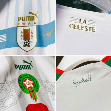
Morocco: Once again falling in line with their other away kits, Puma have offered Morocco at least a more subtle version of a central pattern they keep pushing. This time they have broken from a shield to a geometric central pattern that at least keeps it different from the others that Puma have announced, as well as looking less of a distraction. The green and white trim on the white base give off “It’s Christmas SZN but not close enough to start wearing my ugly sweater” vibes. The light beige stripe along the middle does remind me of a wrapped present. Unfortunately not the wrapped I am looking forward to. 5.5/10
GROUP G
Brazil: Nike is either hitting it out of the park or falling flat on their faces. This is the latter. There’s so much that can be done with a nice blue away, but they solely include a leopard pattern with a gradient on the sleeves that’s gone by the edge of the shoulders. They deserve better. 4/10
Cameroon: Continuing with the Transformers inspiration from their home kit, the design does look better on white than it did on the predominantly green former. The colours pop out more on the white and it definitely shows. I’m sure Cybertron approved of this one. 5/10
Switzerland: Another Puma design, another shield in the middle. Unfortunately no amount of flag jokes can save Switzerland this time. A very plain design with horizontal grey stripes down the middle that look completely out of place from the kit. This looks less like something the best of the Swiss would wear on the pitch and more of a complimentary shirt lifeguards would be given on a team building trip.The red outline on the shield at least looks more complimentary for the Rossocrociati, so that’s a huge plus for the huge plus (my calc class tells me this is equal to huge plus2). 6/10
Serbia: Wow. The gold trim on the white background is always an incredible contrast, and it proves it on what is definitely one of the best kits of the tournament. Or at least it would’ve been. Unfortunately as is the case with the Puma aways, the giant shield in the middle continues to be an eyesore that limits the great to OK. 5.5/10
Group H:
Ghana: To put it mildly, Puma dropped the ball with the away kits this year. The massive square in the middle is an eyesore. The red stripe down the middle also keeps the kit looking basic. Unlike the Wales home the red on red here makes it look like a bog standard kit that does little to stand out from the pack. At least the green and yellow trim is a nice touch. 3.5/10
Portugal: Portugal have gone with more creative designs this time around and while the home may have been a miss, this one is definitely a hit. The thick band in the middle is a very nice idea with a better execution, limiting the green for more maroon helps it pop on the eggshell base. Simple yet different from the entire field. Consider this redemption. 7.5/10
South Korea: This one almost looks like one of those HARD IN THE PAINT kits that get designs on after they’re released, but falls just a bit short, more in the kindergartener came to class with the 128-crayon-box-with-attached-sharpener. Still looks nice and funky, like a solid secondary. 8/10
Uruguay: The home kit was so good they had to balance it out with this one. The shield in middle remains an eye sore as it does with most Puma away kits this tournament. The baby blue stripes on the white look elegant as does the blue and white on the sleeves. It’s a just a shame the centre is so awful. 5/10